OpenNebula
Turning 21 inconsistent resource views into one console pattern — audited against OpenNebula's own docs, iterated through three panel versions before anything shipped.
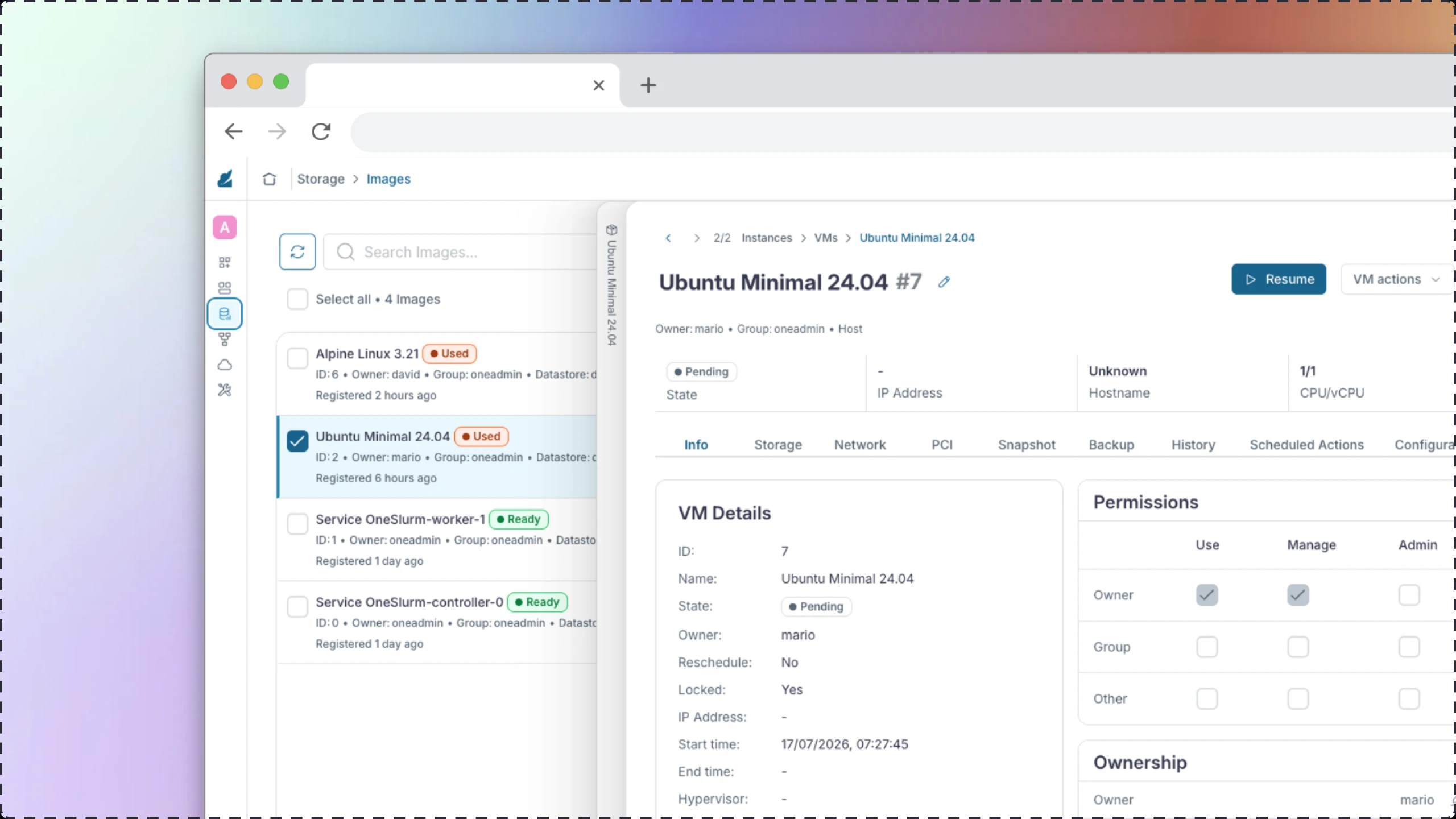
An open-source console, redesigned resource by resource.
OpenNebula is open-source software for building and managing private, public and edge clouds — data centers, virtual machines, storage and networking, all from one console called Sunstone. It's dense, powerful, and shows its age in the UI.
The redesign covers Sunstone 7.0's navigation and resource views: 21 resource types, from Virtual Machines and Templates down to Marketplaces and ACLs, each rebuilt with a consistent card/table/detail pattern instead of the inconsistent, resource-by-resource layouts in the current release.
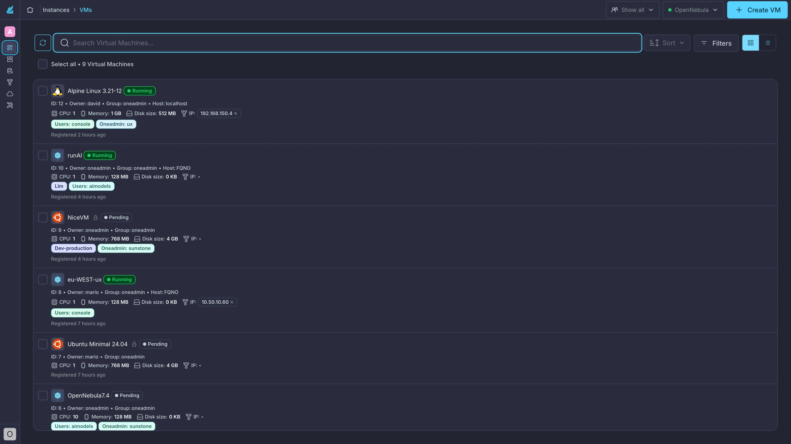
Twenty-one resources, no shared pattern.
Every resource type in Sunstone had grown its own list layout, its own detail-panel behaviour, and its own reading of what the product's own documentation actually recommends.
Auditing the shipped UI against OpenNebula's own 7.0 docs surfaced real mismatches: VM Groups lived under Templates when the docs treat them as an operational concept under Instances; Marketplace Apps were buried in Storage when user intent points to their own section; VNet Templates sat in Networks instead of Templates. The detail panel was worse — card view opened it as a right-side panel, table view opened it at the bottom of the screen, and switching view modes mid-task meant relearning where information lived.
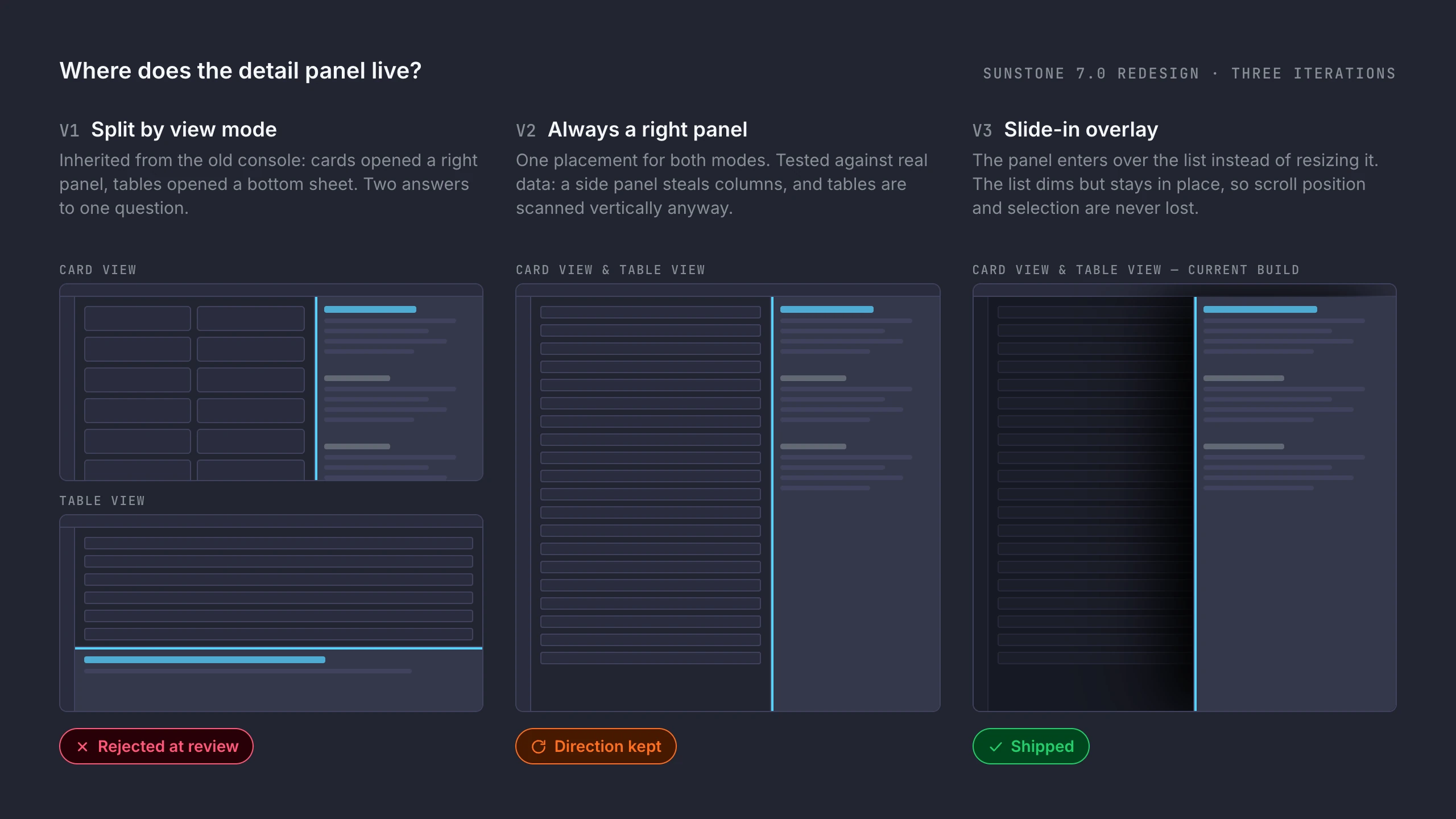
Audit the docs, prototype the panel, ask the room.
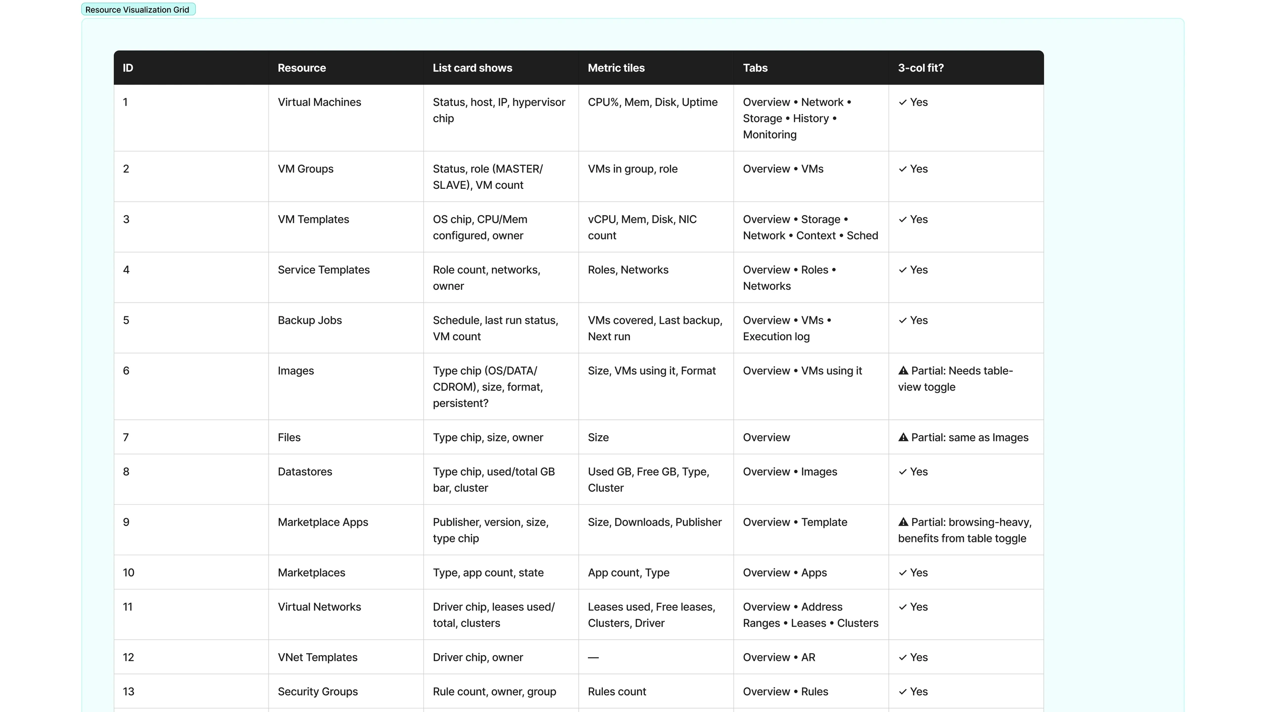
Every resource got mapped against the official OpenNebula 7.0 documentation to settle what a card should show, what belongs in metric tiles, and which tabs a detail view needs — before touching a single screen. The open question that took the most iteration: where does the detail panel live?
V1 kept the old split (right panel for cards, bottom sheet for tables) and a stakeholder review flagged the inconsistency immediately. V2 tested "always right panel" against real data — it turned out right-side panels read better for tables too, since they steal columns instead of rows, and tables are scanned vertically anyway. V3, the current build, drops the panel in as an overlay from the right in both view modes, with the underlying list dimming slightly so users never lose their place.
One console, one set of patterns.
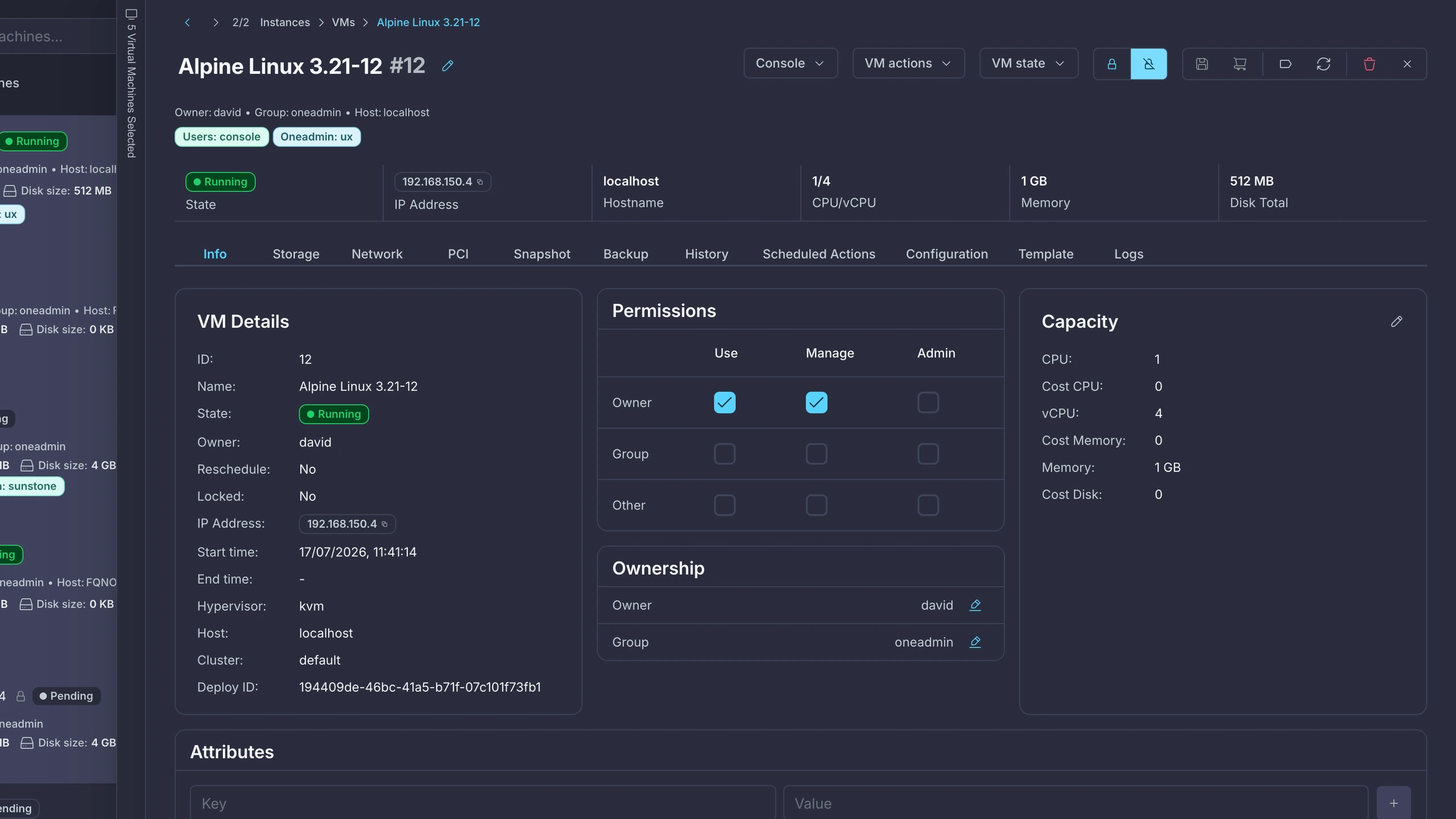
One drawer, every resource
The same right-side overlay pattern now covers all 21 resource types — the same muscle memory whether you're looking at a VM or an ACL rule.
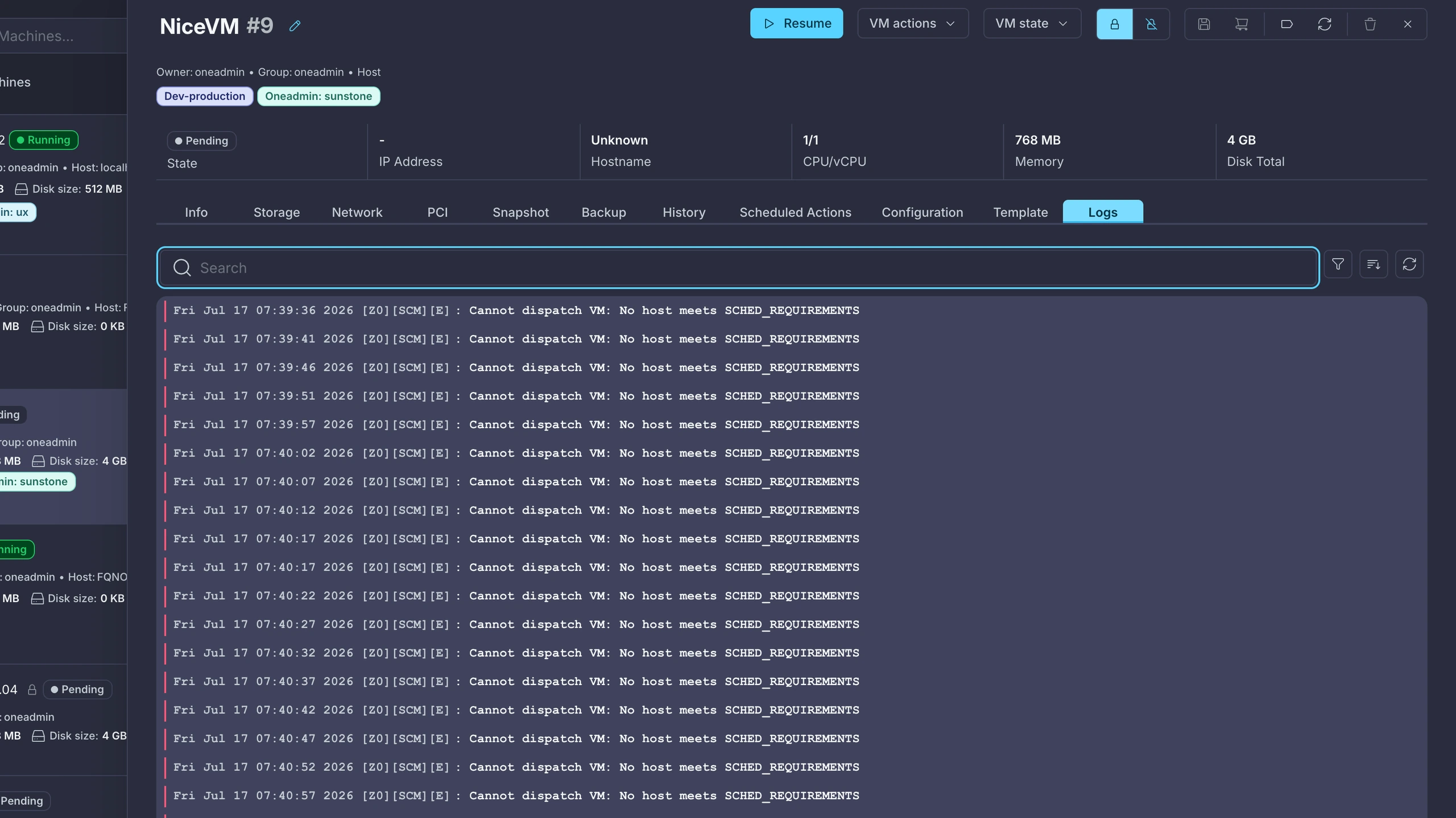
Logs without losing context
Monitoring and log tabs sit inside the same drawer, so checking a VM's history never means leaving the list behind.
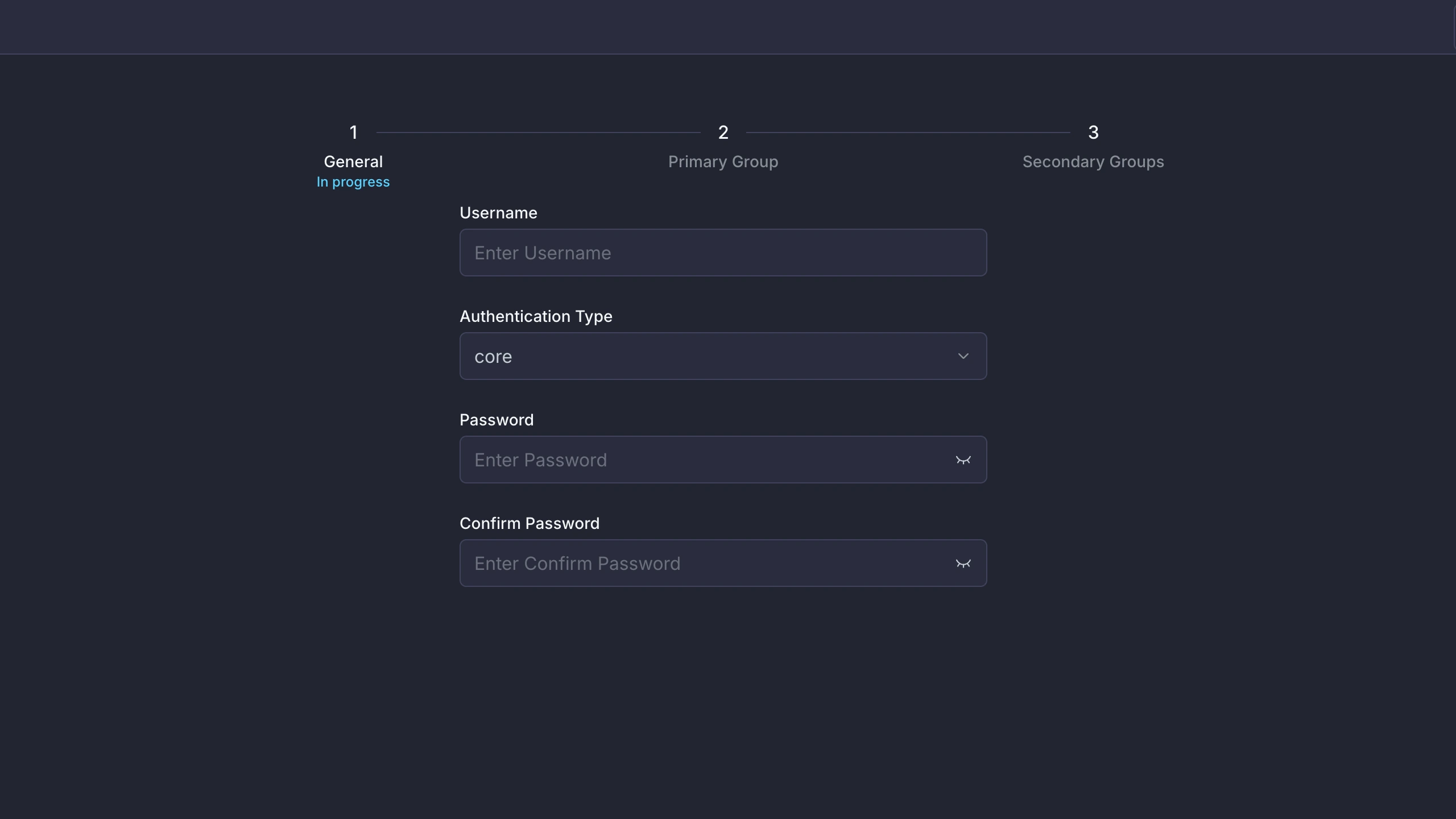
Multi-step wizards, broken down
Admin-heavy flows like user creation are split into clear steps instead of one long form — general info, permissions and groups handled in sequence.
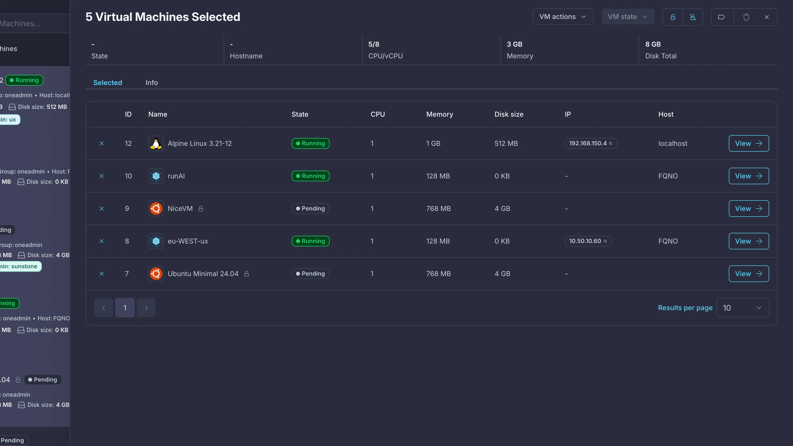
Act on many at once
Selecting multiple resources surfaces a summary bar with the actions that make sense for the whole set — no more repeating the same action row by row.
Tokens that hold up in both themes.
Every surface, border and status colour is a token mapped from Figma variables, verified in both dark and light mode side by side — not just a dark theme with light values guessed afterward. Typography holds to a small scale (12–24px, weights 400–600) so nav items, table cells and page titles stay visually consistent across all 21 resources.
Status is always colour + label + icon together, never colour alone — the same rule that makes the Labels and Tags work applies here: at-a-glance state should survive a screenshot, a colourblind user, or a low-quality projector in a conference room.
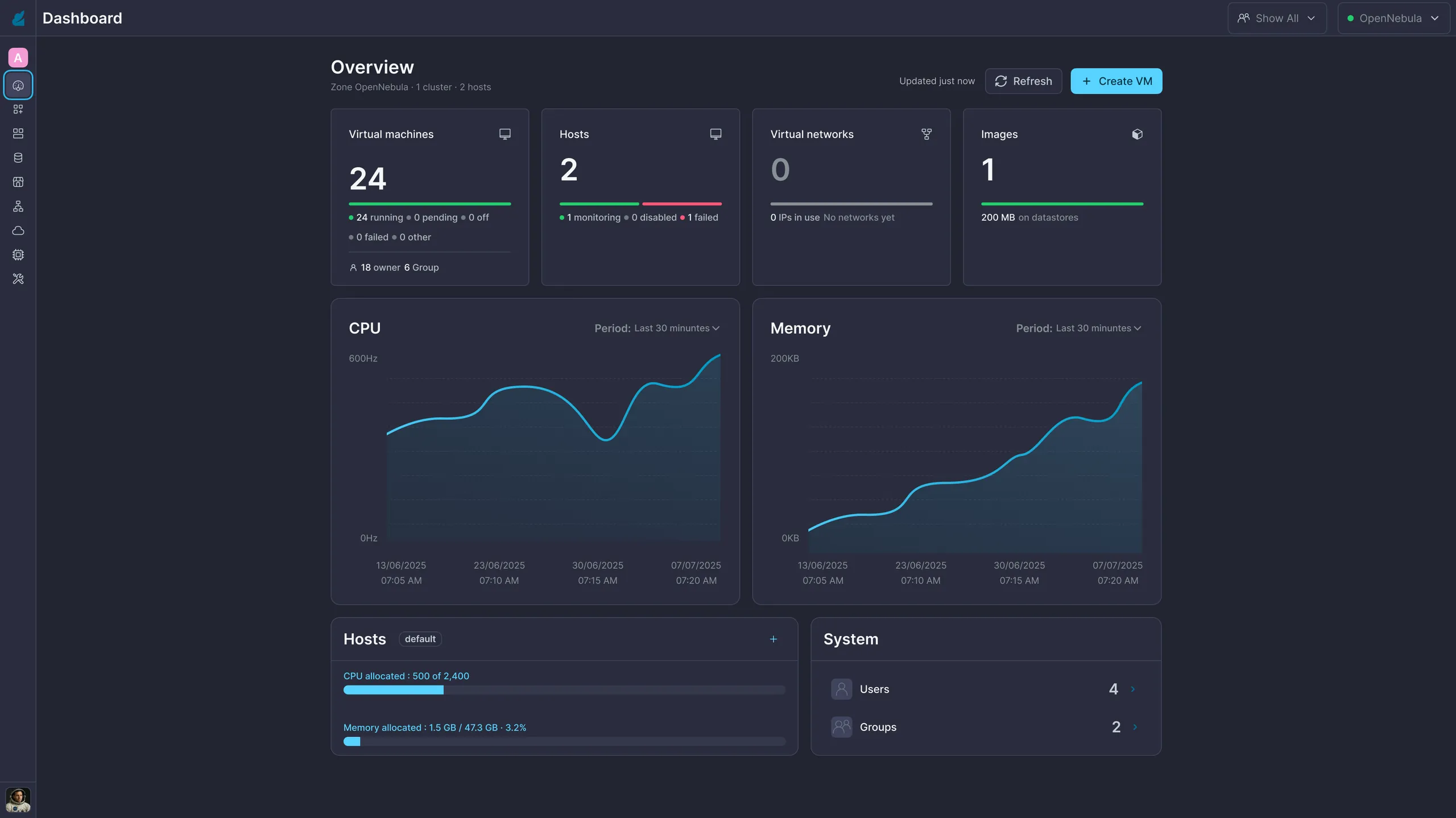
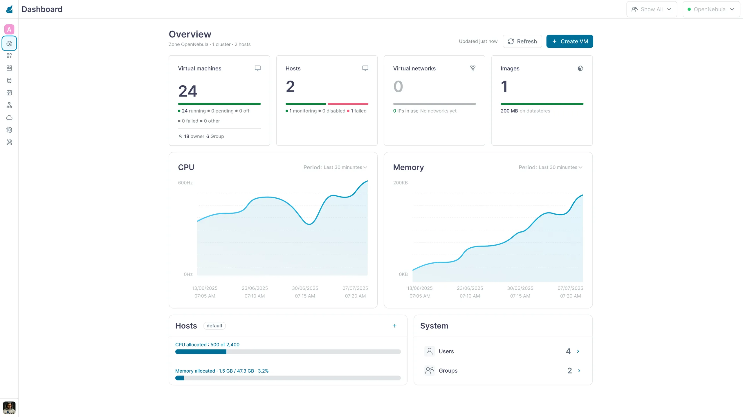
One name, two values.
The tokens aren't transcribed from Figma by hand — a script generates them out of the
Sunstone source, walking the same three-layer chain the product walks: primitives → aliases →
per-scheme roles. 173 names, 98 of them colour roles, each resolving once for light and once
for dark. Names map onto the palette, so --surface-action greps straight
back to schemes/light/surface.js and a developer can find where any value
came from.
#40435c is text/headings in light and
border/primary in dark. The ramp is shared; the roles are not — which is
the part a hex value on its own can never tell you, and the reason these are named for their job
rather than their colour.
Three pairs that don't pass — left in on purpose.
Reading both schemes against each other turned up contrast failures a single-theme review would never surface: each of these passes comfortably in one scheme and fails in the other. I measured them, wrote them up, and raised them with the design-system team instead of quietly swapping in a nicer colour. A prototype that silently repairs the system stops being evidence about the system.
icon/selected on surface/primary, darkThe icon on a selected sidebar row. At 1.03:1 it is not low-contrast, it is invisible — #003447 sitting on #2a2d3d. Passes at 5.56:1 in light.
text/error on surface/error, lightEvery error tag in the console. text/error is the one
colour role in the table above that does not resolve twice — the same
#ff5779 both schemes, which is fine on the dark #290008 (6.28:1) and fails on the
light wash.
text/focus on surface/focus2, lightThe selected sidebar item, the selected table row, the current page. Large text only — and this pair is unavoidable on every screen in the product. 6.22:1 in dark.
Make twenty-one resource types behave like one product.
What I took from it
Documentation is a research artefact
The product's own docs settled what each resource actually means to admins — a fixed reference the shipped interface could be audited against, resource by resource.
Test the boring decision twice
The right-panel-vs-bottom-sheet question felt small until it touched all 21 resources — worth validating with real data before committing.
Consistency is the actual feature
No single screen needed to be clever. The win was making all 21 feel like the same product.
Open questions stay open
Virtual Routers and VDCs still need a placement decision — logged, not quietly resolved by guessing.