Beatclap
Turning an unorthodox release process into an intuitive, error-free platform.
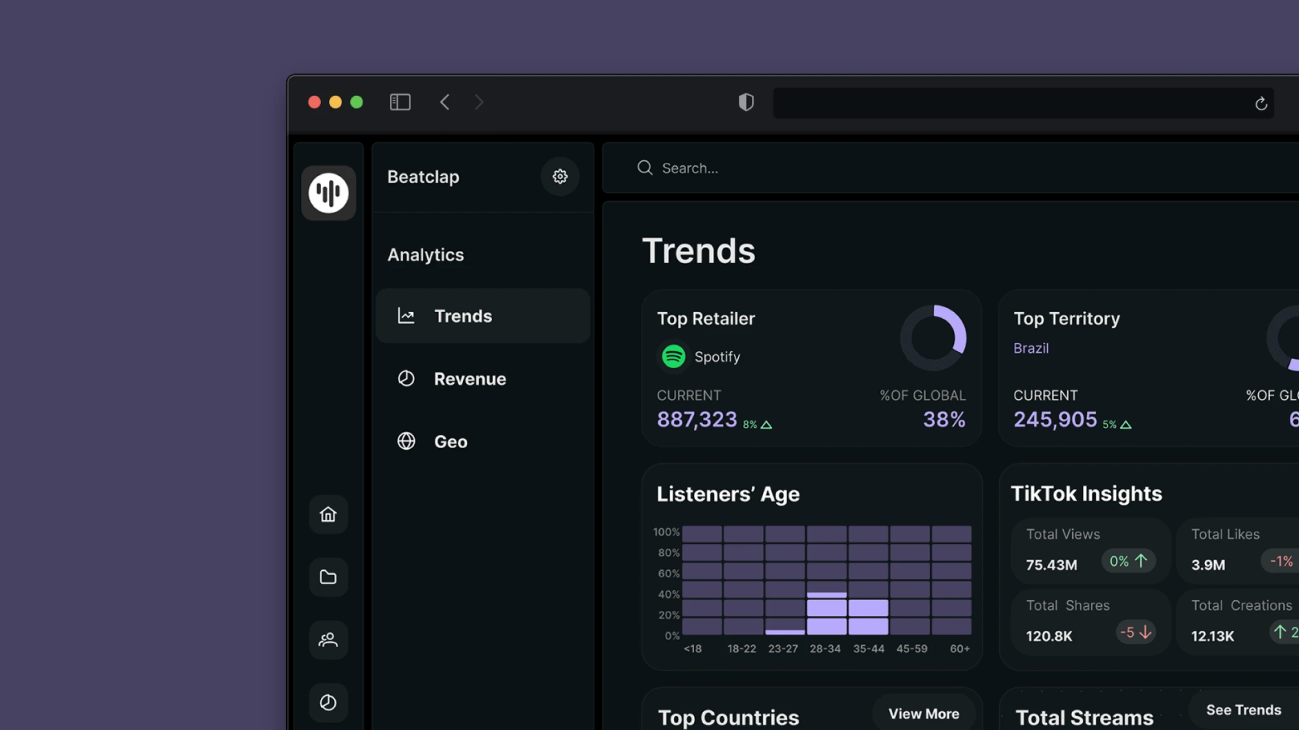
One home for releases, royalties and merch.
Beatclap lets labels and artists manage releases, catalogs, contracts and merchandise in a single platform — replacing a scattered, manual workflow.
Release creation and royalty splits were the community's most-requested capability — and with the legacy platform's sunset date already on the calendar, this update was an opportunity to go out with a bang rather than simply ship a replacement.
The brief was deceptively hard: take an otherwise highly unorthodox update process and package it into something intuitive, error-free, and genuinely desirable to use.
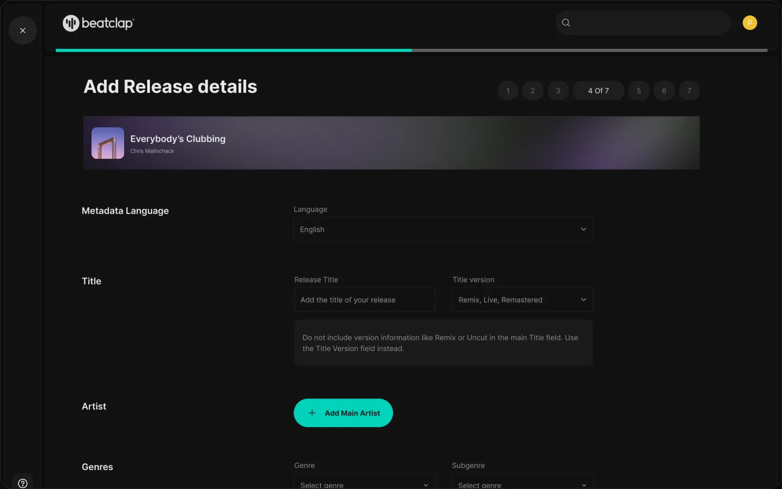
The old flow was powerful but error-prone.
Metadata, release scheduling and royalty splits lived across disconnected tools. Small mistakes cascaded into payment and distribution problems downstream.
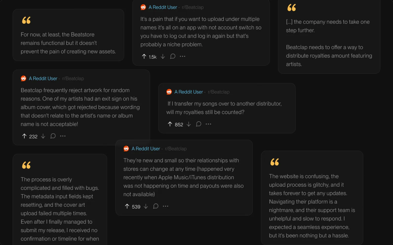
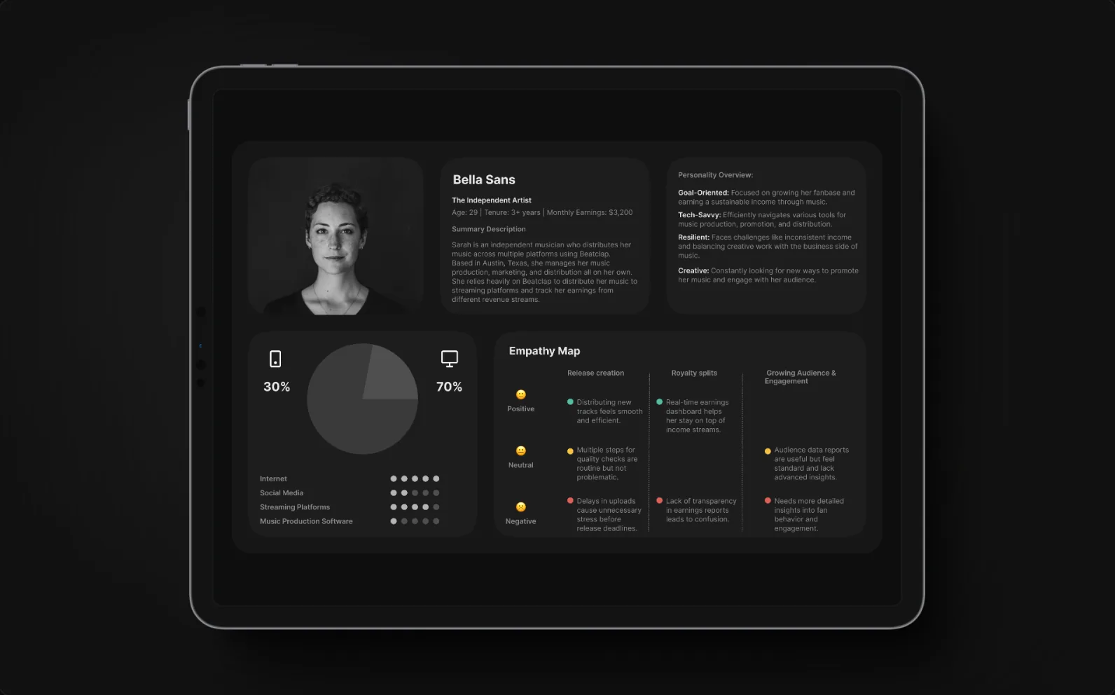
Before touching the UI, I mined the community's own words — public threads on failed uploads, opaque royalty transfers and support queues that never answered — and clustered them into a journey map. The pattern was unambiguous: artists didn't fear complexity, they feared irreversibility. Every design decision that followed traces back to that insight.
Users needed to move fast without breaking things — which meant the interface had to make the correct path the easy path, and the wrong path hard to take.
“The process is overly complicated and filled with bugs… even after I finally managed to submit my release, I received no confirmation or timeline.”
Independent artist, public forum thread — one of dozens clustered during discoveryDiagnose before designing.
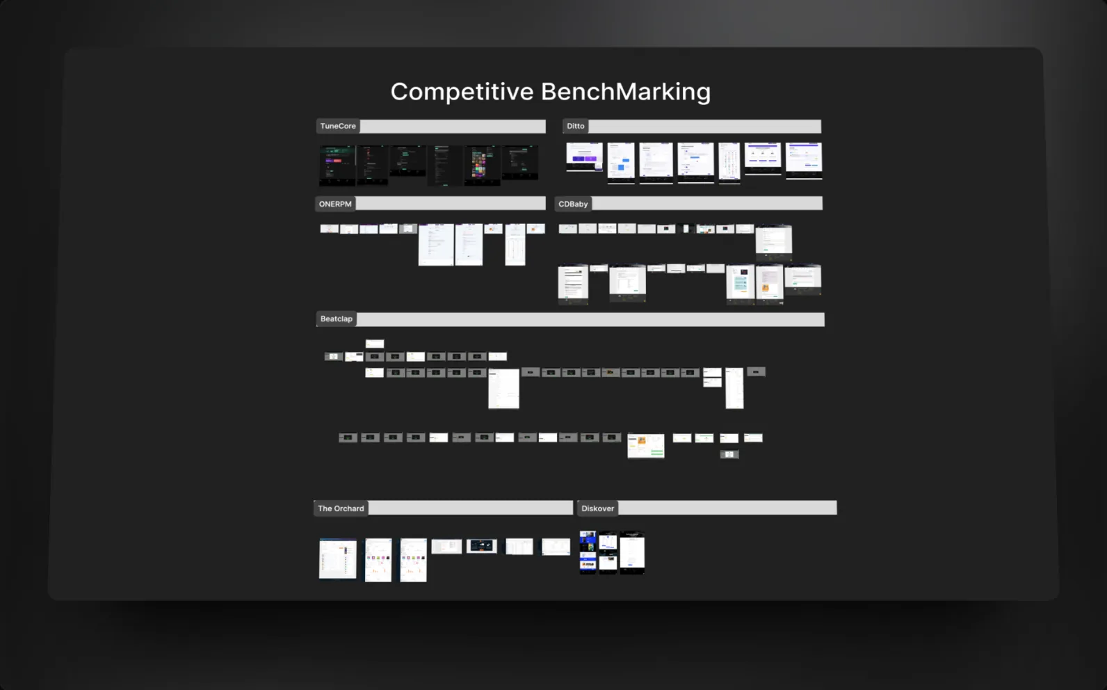
Competitive benchmarking set the bar. Journey mapping turned community complaints into addressable moments, and a jobs-to-be-done lens kept every screen anchored to what artists actually hire the platform for — flows were pressure-tested on paper before a pixel was polished.
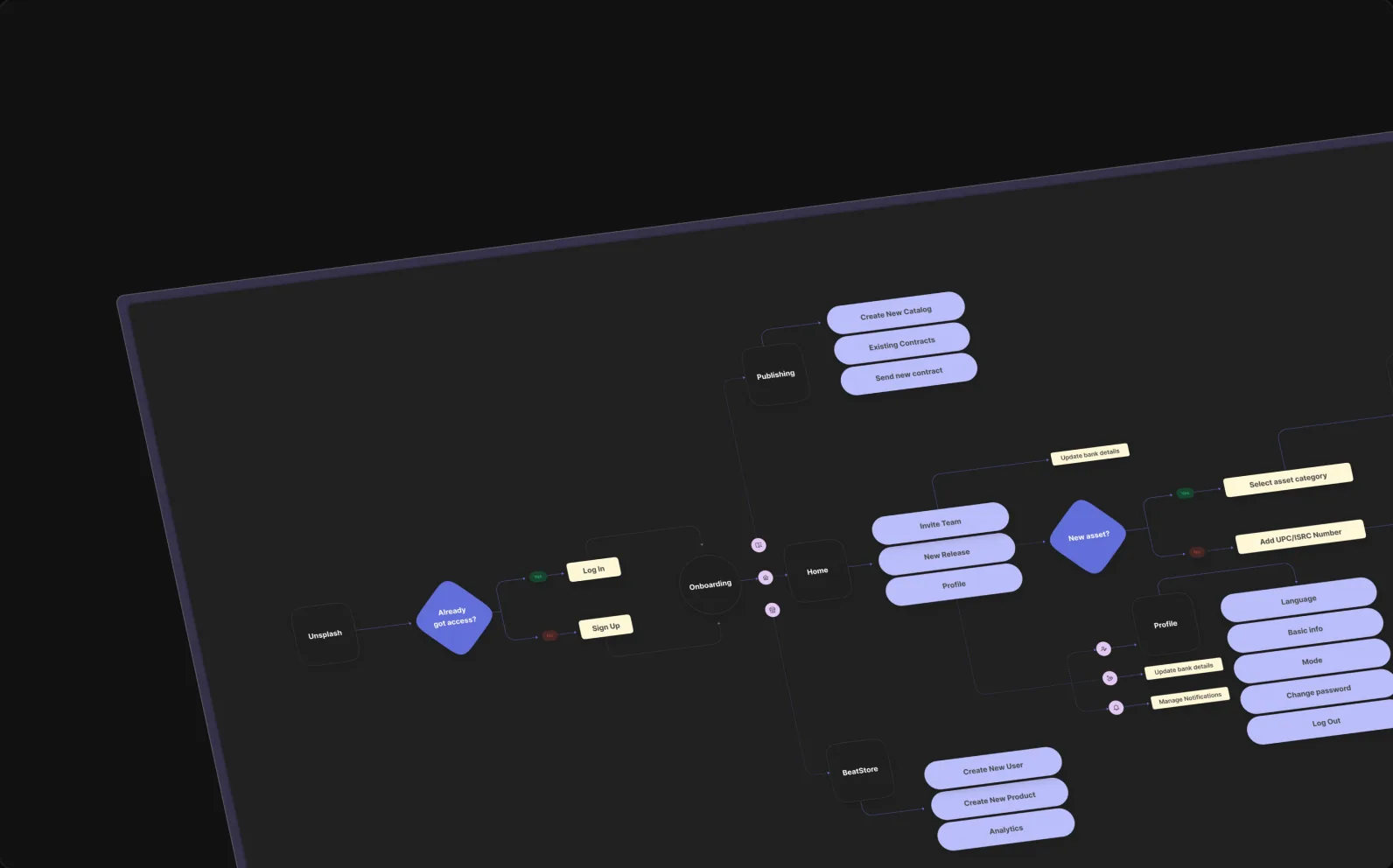
Five flows, one consistent system.
Each flow got the same treatment: fewer decisions per screen, honest feedback, and one consistent component language.
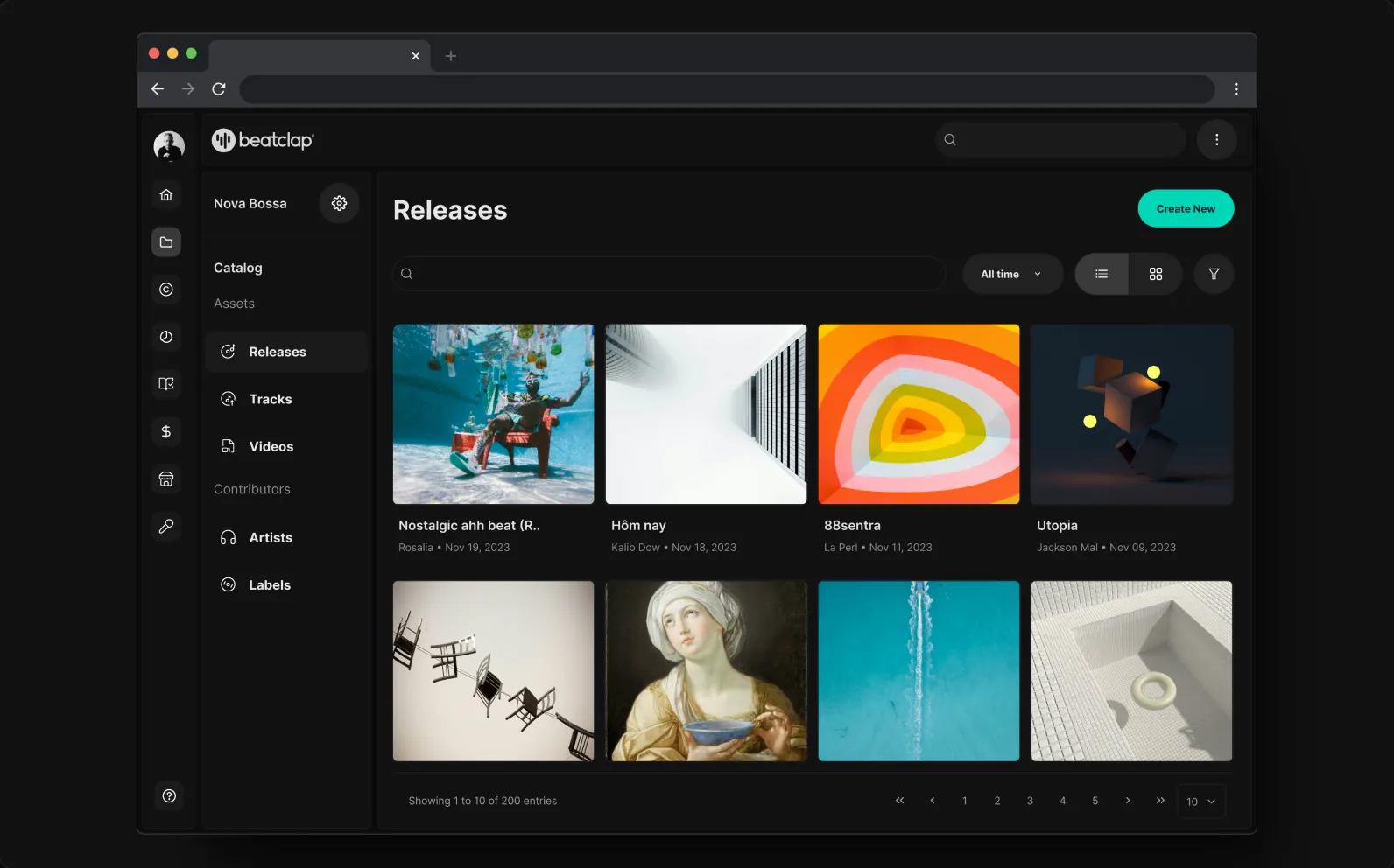
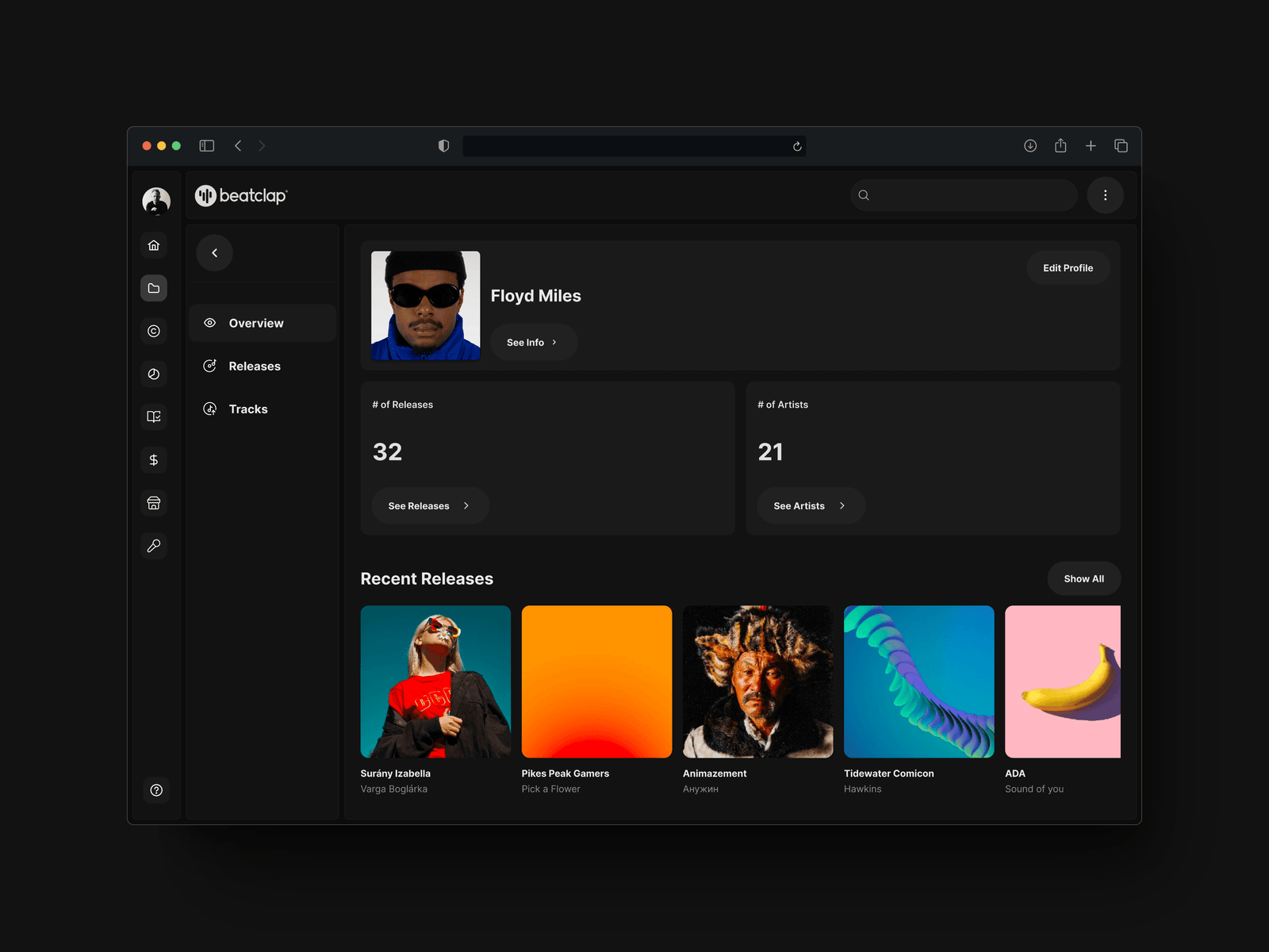
Simplified access to content
All releases, artists and recent activity in one structured, scannable view.
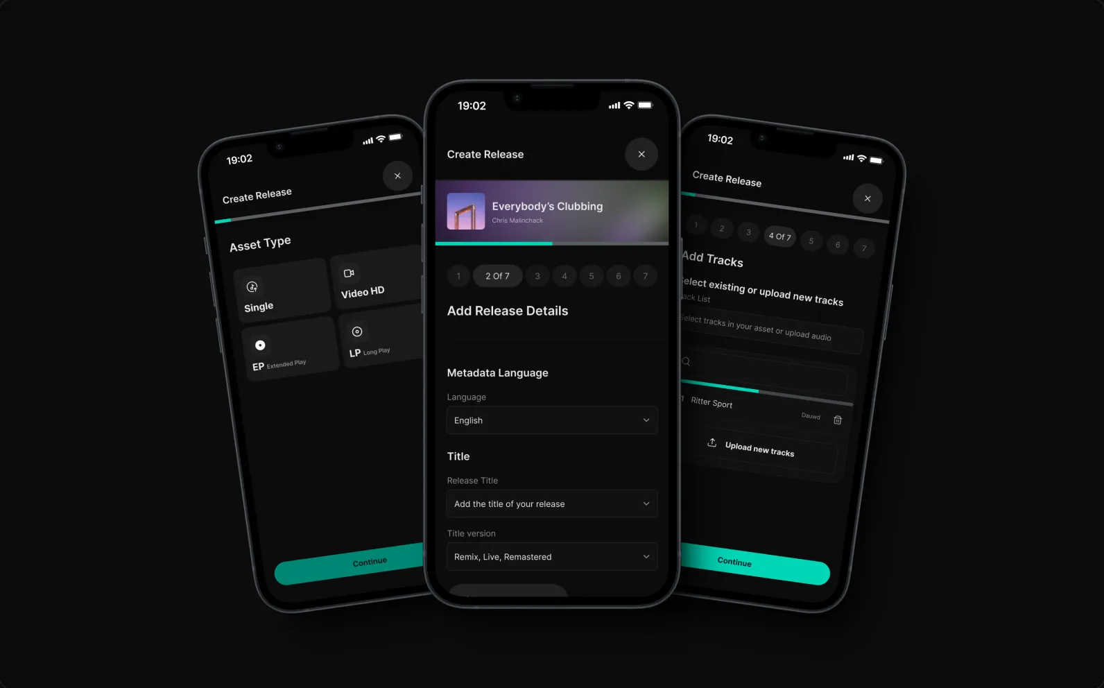
Mobile-first, step-by-step
The release flow is broken into clear, manageable steps — pick asset types, add metadata, upload tracks from any device.
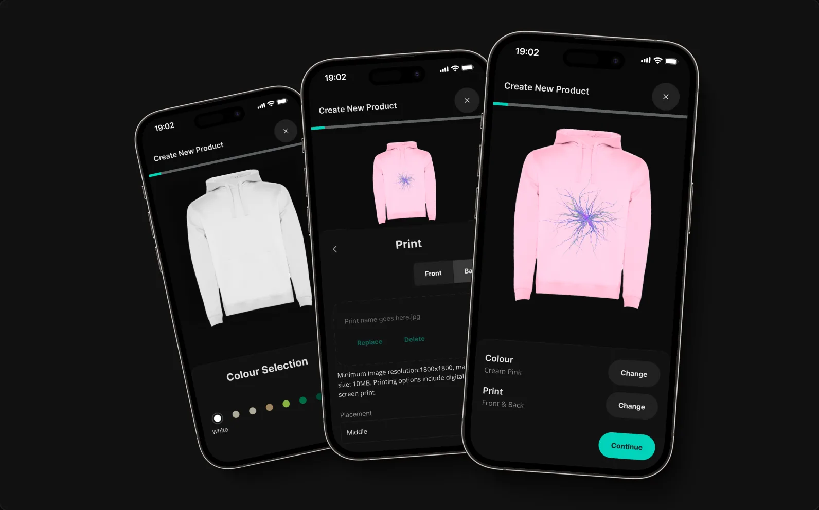
Customisable merch creation
Create and personalise merch with colour selection, print customisation and live product previews.
Key metrics, centralised
A clear snapshot of releases, artists and recent activity — the essential numbers one click deep, never buried.
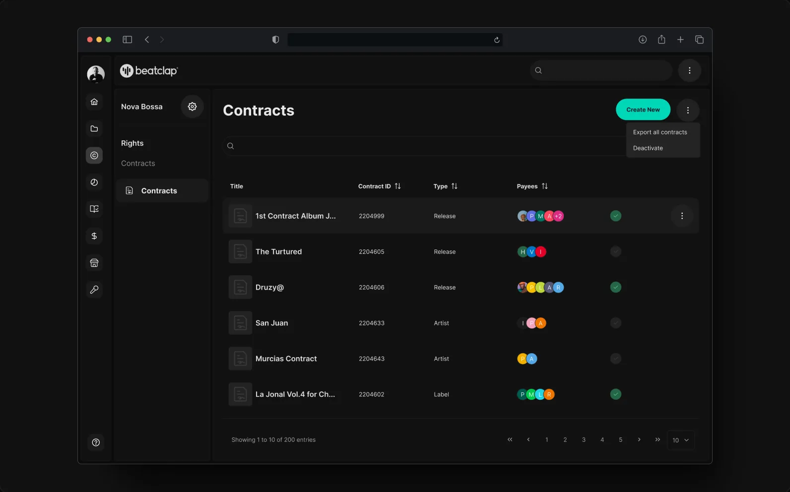
Royalty splits, made legible
Create and manage splits — assign terms and permissions without the spreadsheet anxiety.
No fluff. Consistent and scalable.
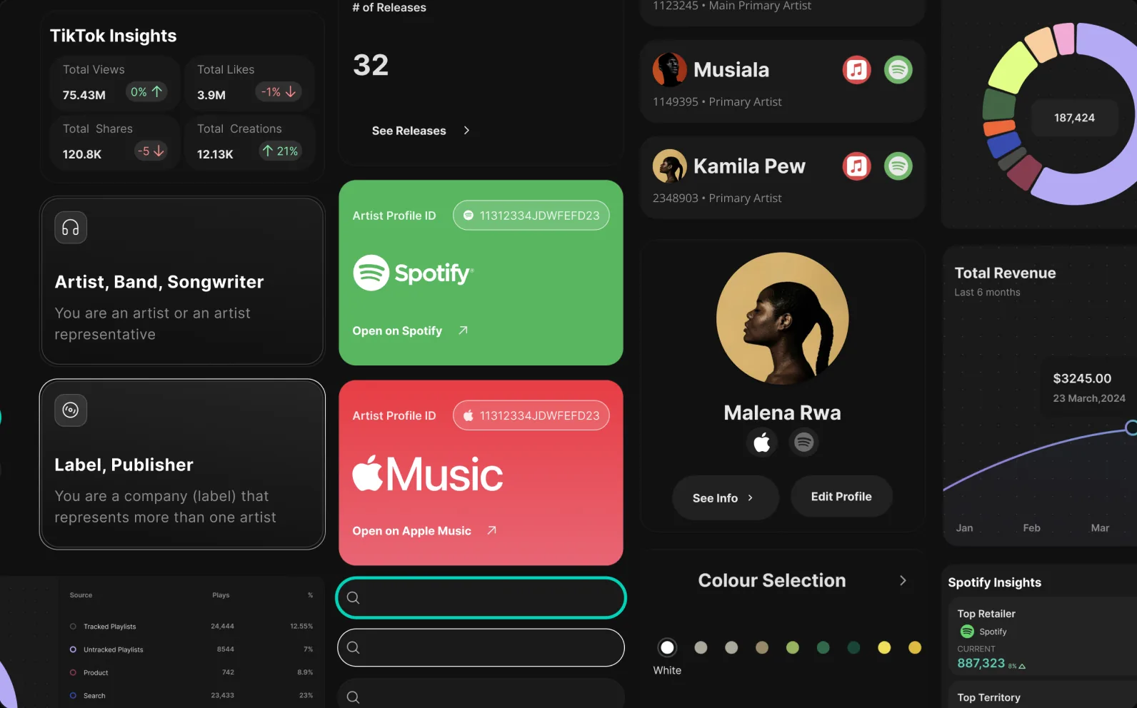
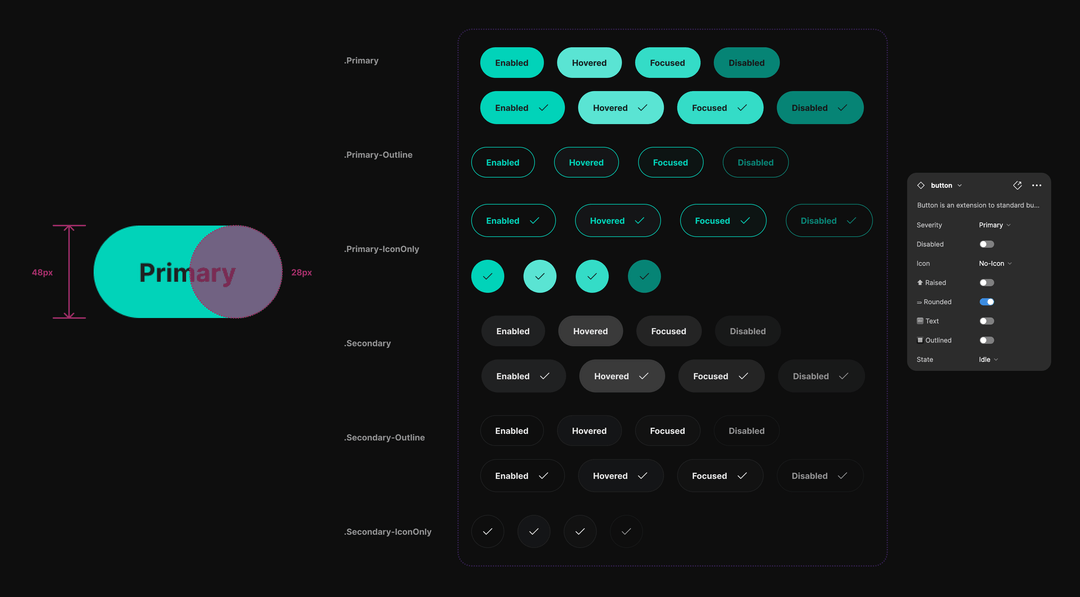
A tight token set, reusable components and clear states — built so the product could grow without the UI drifting.
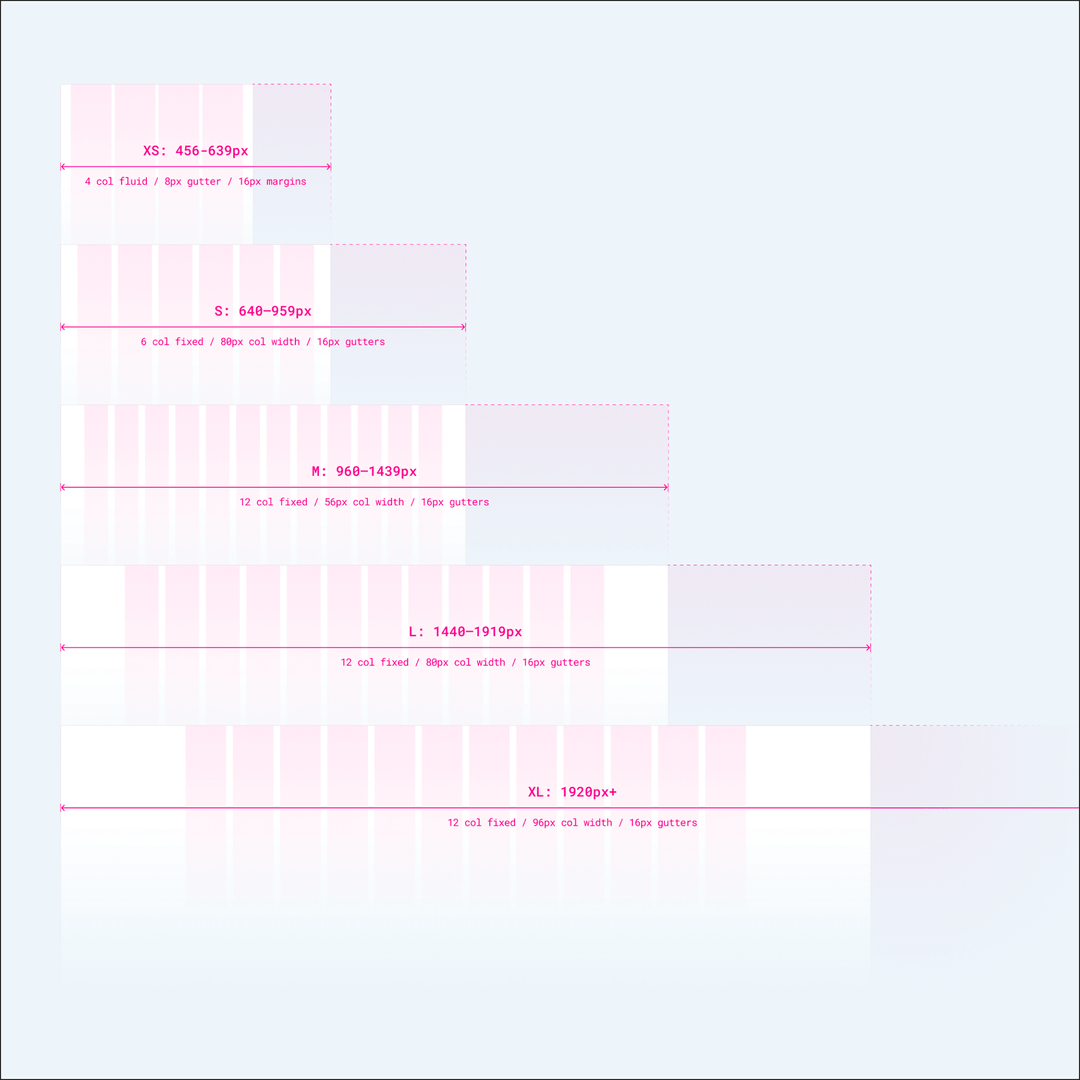
A standard set of layout grids and breakpoints kept design and build fast and consistent from small screens to 1920px+, while the component set carried one visual language across web and iOS.
Shipped before the sunset — and it moved the numbers.
The redesign launched ahead of the deadline. In the months after relaunch, active users grew 30% and retention rose 15% — the community's biggest request had become the platform's strongest feature.
Take an unorthodox update process and make it intuitive, error-free, and desirable.
What I took from it
Find opportunities within constraints
Viewing constraints from different angles surfaced new approaches to tackle the others.
Leverage existing resources
Knowing where to find existing design resources and when to use them saved immense time and overhead.
Involve cross-functional partners early
Bringing them in from the start kept the work holistic and accounted for content and technical feasibility.
Simplicity ≠ fewer features
It meant reducing complexity. An extra step toward a more intuitive, error-free experience was worth the effort.