Darktrace Mobile
Redesigning the Darktrace mobile app so autonomous AI security stays legible on the go.
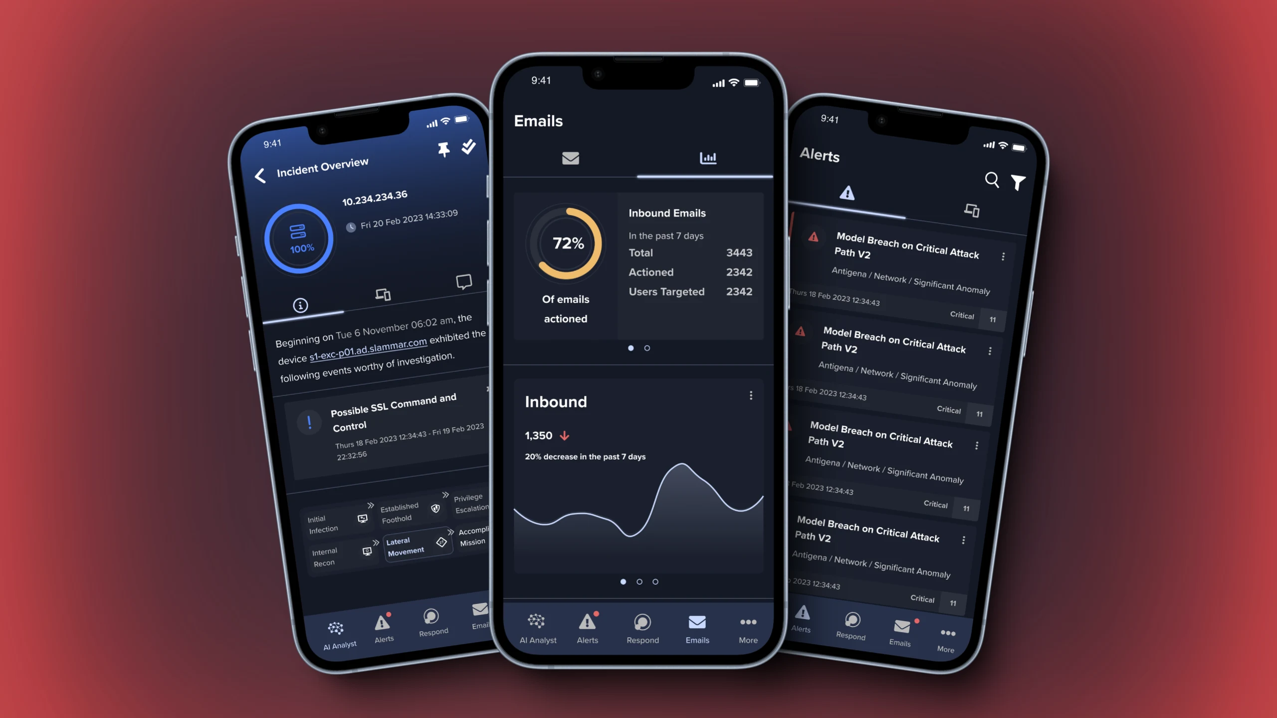
A new direction for Darktrace.
The Darktrace mobile app had an outdated design that was hard to use and didn't deliver an optimal experience. The brief: make it intuitive, friendly and visually appealing — without losing the core cybersecurity power that makes Darktrace effective.
As lead designer I owned feature scoping, research, interaction, visual design and prototyping — and we had to ship ahead of the "LOOP 6" rebrand.
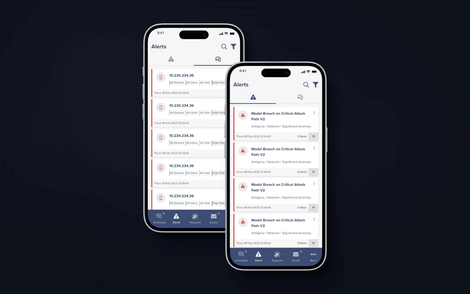
A pile-up of constraints.
New features and products had to land without compromising the existing experience — for an audience with wildly varying levels of technical expertise.
The hardest part: presenting complex, AI-driven cybersecurity information in a way that's easy to digest and act on. The outdated UI had hurt engagement and satisfaction; the redesign had to make the right action the obvious one — with clear instructions and honest progress and error states.
Audit, listen, synthesise, prioritise.
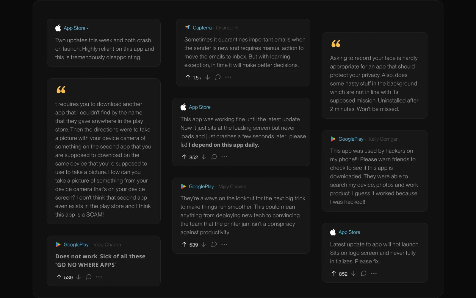
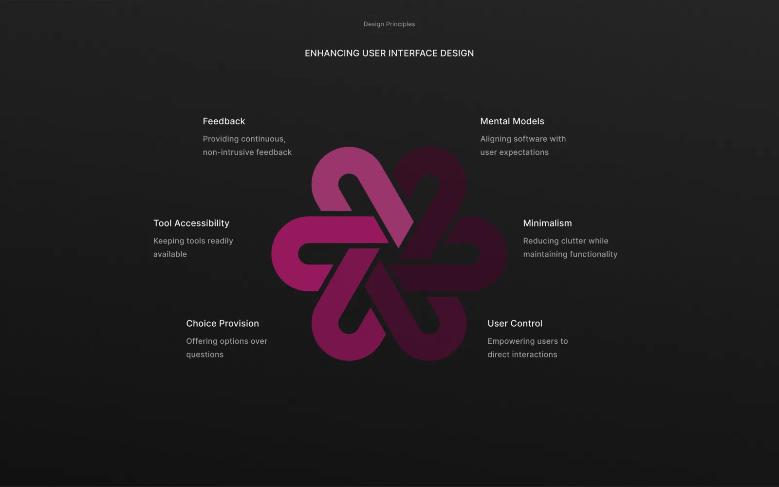
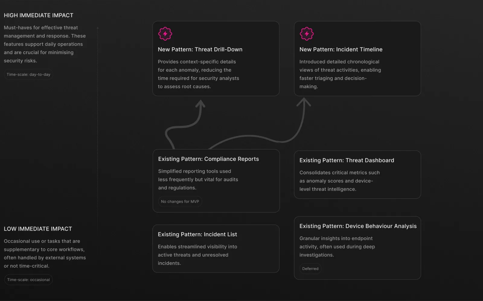
A heuristic evaluation benchmarked the existing app against leading SIEMs (Splunk, IBM QRadar), while real App Store and Google Play reviews grounded the redesign in what users actually struggled with day to day. The two fed a shared set of design principles, then a high/low-impact map made prioritisation explicit before a single screen was drawn.
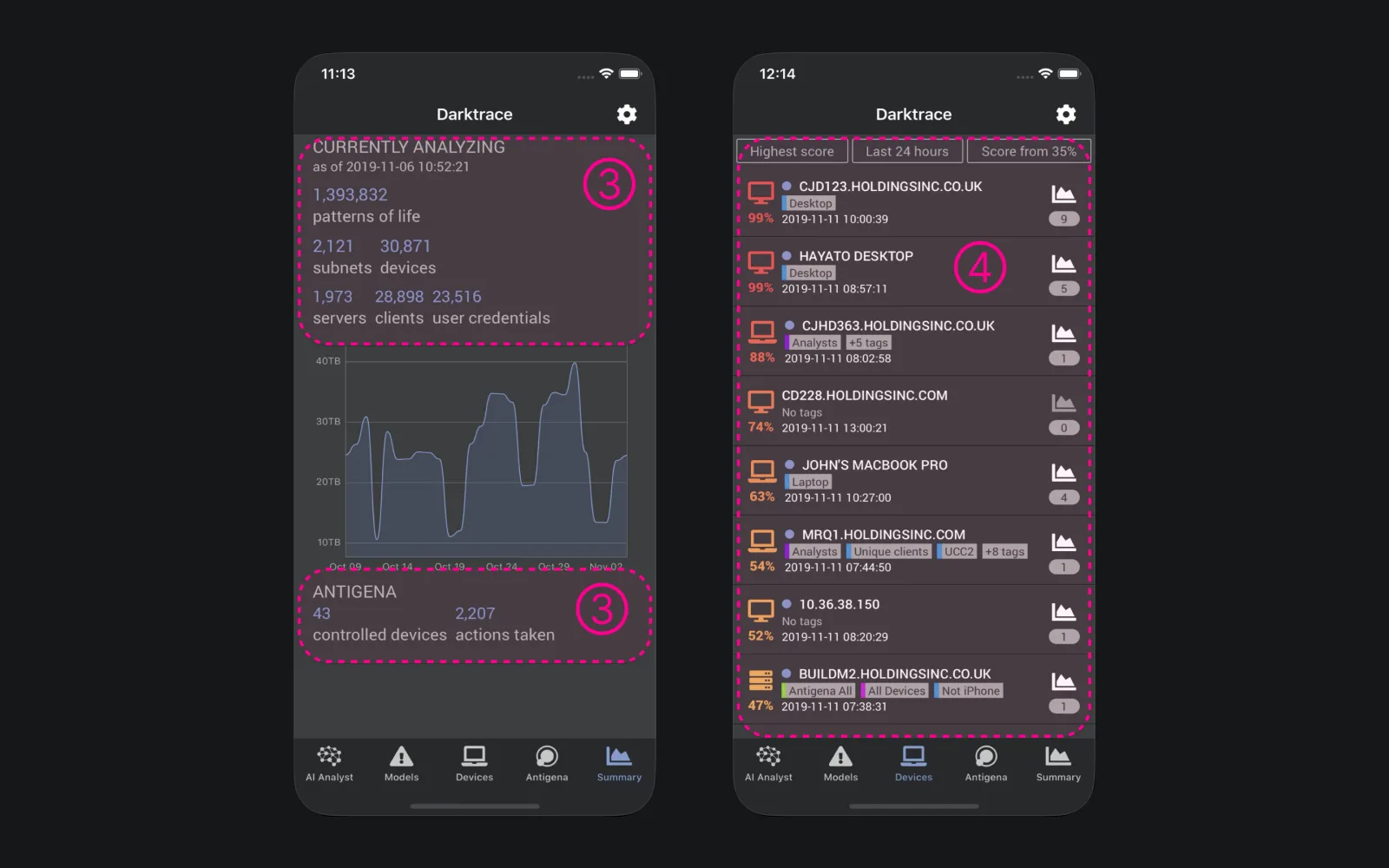
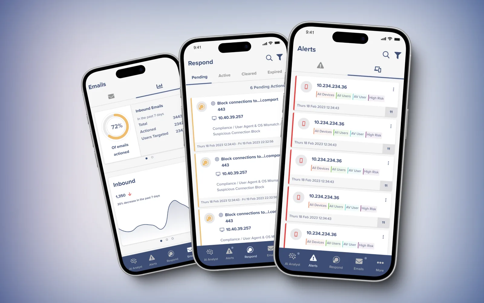
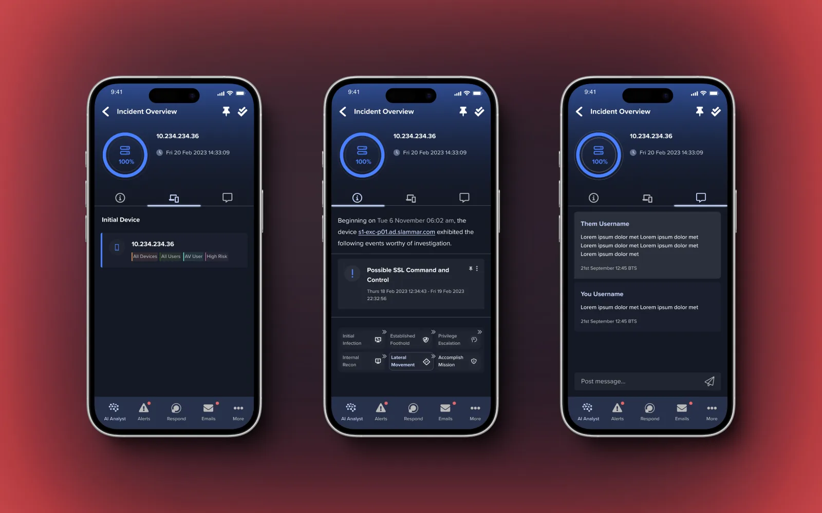
Designed for clarity under pressure.
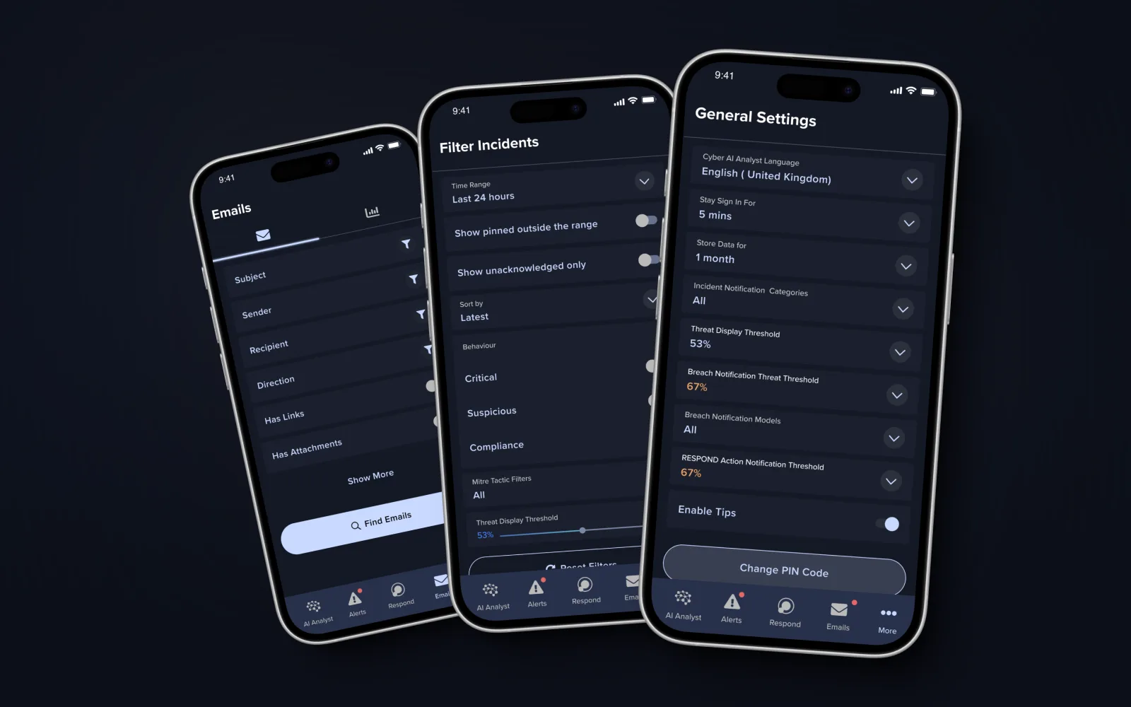
Confirm every action
Applying filters or changing settings now gives clear visual confirmation — no more silent, uncertain taps.
Undo & reset
Filters and sorting stay flexible, but a clear way to revert changes keeps users in control.
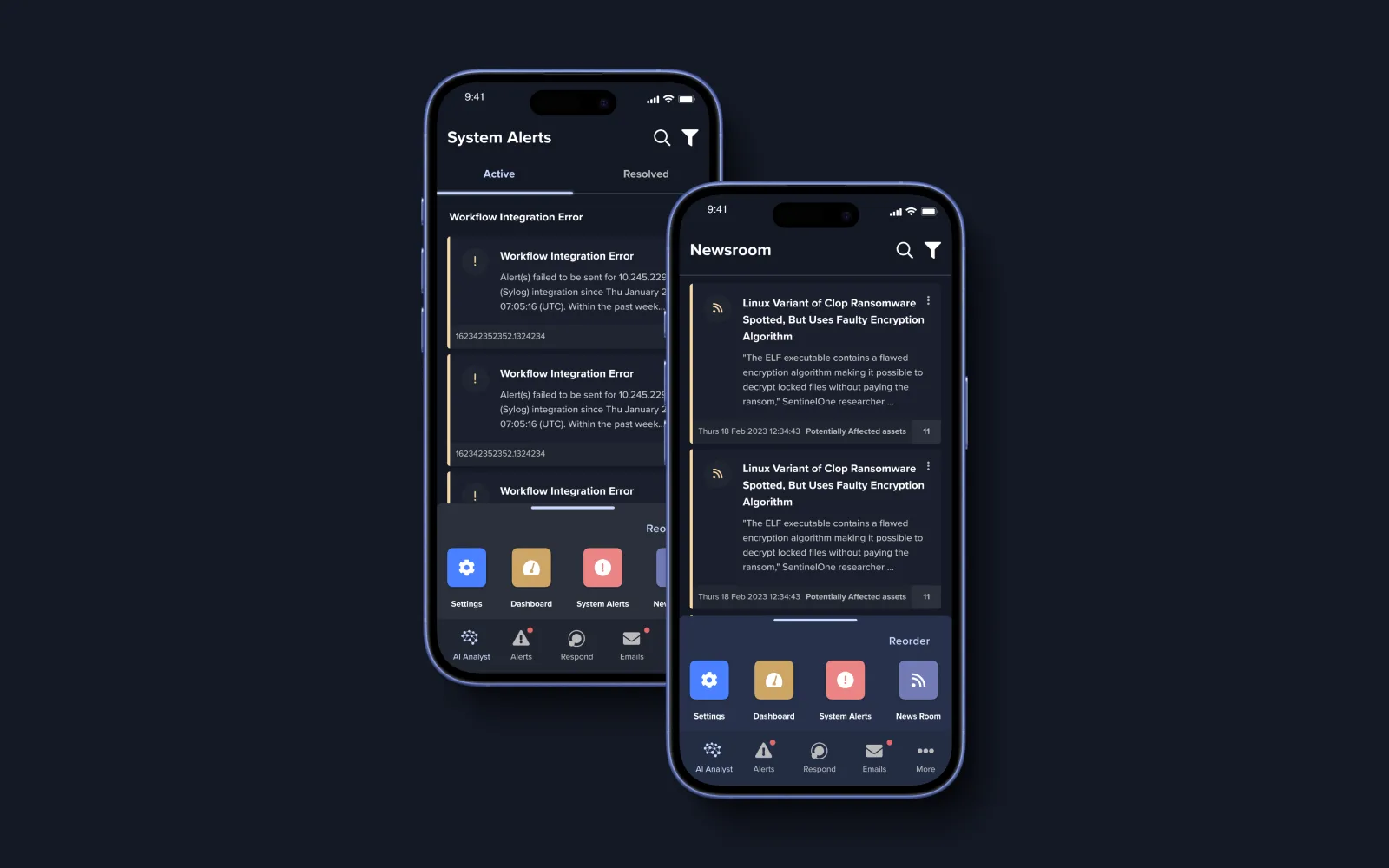
Always know where you are
Clearer current-tab feedback and contextual wayfinding for deeper tasks across AI Analyst, Models and Devices.
Plain-language security
Tooltips and friendlier explanations demystify terms like "Antigena" and "Patterns of Life" for non-expert users.
Components that scale with the product.
A consistent set of buttons, cards, states and tokens — built so new products could be added to the app without the UI drifting, and aligned to the LOOP 6 rebrand.
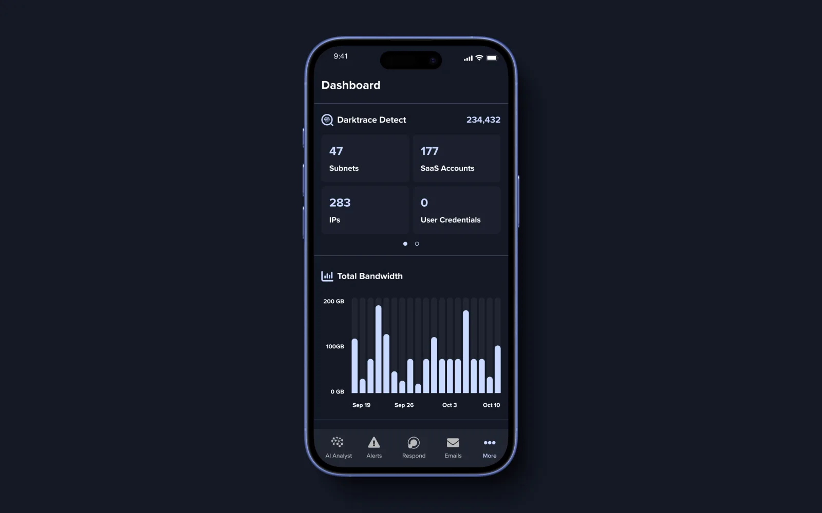
Make complex AI security simple, accessible and actionable.
What I took from it
Simplify without dumbing down
Reducing density made the AI's decisions more trustworthy, not less powerful.
Design for mixed expertise
The same screen had to serve security veterans and newcomers — tooltips and plain language bridged the gap.
Confirm and forgive
Visible feedback plus easy undo turned a high-stakes tool into a calmer one to operate.
Ship to the moment
Scoping tightly let us land ahead of the LOOP 6 rebrand without cutting the experience.